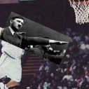
pionteczekessa Napisano 1 Października 2013 #76756 Napisano 1 Października 2013 Z nudów zrobiłem logo dla sieci. Jest w takich samych wymiarach jak aktualne logo i ma zmniejszoną przeźroczystość po bokach ;>.
#RELOP Napisano 1 Października 2013 #76761 Napisano 1 Października 2013 Przyznam się, że mi się podoba 9/10.
TWS Napisano 1 Października 2013 #76783 Napisano 1 Października 2013 http://www.allfons.ru/pic/201112/1366x768/allfons.ru-1269.jpg a może zrobisz coś samemu !
pionteczekessa Napisano 1 Października 2013 Autor #76784 Napisano 1 Października 2013 http://www.allfons.ru/pic/201112/1366x768/allfons.ru-1269.jpg a może zrobisz coś samemu ! Raczej nie narysuję samemu obrazka ;x. Obrazek z aktualnego loga też kradziony .
TWS Napisano 1 Października 2013 #76786 Napisano 1 Października 2013 Tak tylko napisałeś, że się nudziłeś dlatego zrobiłeś logo, dodanie napisu do tego obrazka zajmuje ile 1 min może 2 a nudząca się osoba raczej ma dużo czasu wiec mogłeś chociaż coś w nim pozmieniać. Nie mam tutaj na celu obrazić Cię tylko w sprawie grafiki akurat jestem krytyczny wiec po prostu ta praca nie robi na mnie żadnego wrażenia.
pionteczekessa Napisano 1 Października 2013 Autor #76788 Napisano 1 Października 2013 Przyjmuję krytykę. Postaram się coś jeszcze zrobić innego.
#RELOP Napisano 2 Października 2013 #76842 Napisano 2 Października 2013 W takim wypadku jestem na nie, zgodzę się z użytkownikiem "Szyrley" praca kradziona + napis.
pionteczekessa Napisano 2 Października 2013 Autor #76847 Napisano 2 Października 2013 W takim wypadku jestem na nie, zgodzę się z użytkownikiem "Szyrley" praca kradziona + napis. Nie kradziona, znalazłem taką tapetę na internecie, więc jest dla wszystkich. Ale jak już wyżej pisałem, zrobię coś samemu.
Gość Guest Napisano 2 Października 2013 #76856 Napisano 2 Października 2013 Dłużej ci chyba zajęło szukanie fajnego obrazka niż jego edycja. Oj oj
Gość Guest Napisano 2 Października 2013 #76859 Napisano 2 Października 2013 @up Hahahaha Daje 3/10 za pomysł i chęci. Postaraj się zrobić coś samemu od podstaw.
Varg Napisano 2 Października 2013 #76881 Napisano 2 Października 2013 Wystarczyłoby ściągnąć render i nawalić parę bruszy, wyszedłby taki sam efekt, a nie bezczelnie dać czcionkę na obrazek. Zero pracy, jak można chwalić się czymś takim..
Gość Guest Napisano 2 Października 2013 #76917 Napisano 2 Października 2013 Liczą się chęci Panowie :P Ale mogłeś się postarac
Gość Guest Napisano 2 Października 2013 #76964 Napisano 2 Października 2013 Czy "kradziona", znaleziona, czy też nie wiadomo ile pracy w to włożyłeś sądzę żę nasze aktualne logo jest lepsze. Jestem przeciw zmianie.
Gość Guest Napisano 6 Października 2013 #78344 Napisano 6 Października 2013 Bez obrazy ale ja tez tak umiem . Bawie sie tak czasem że se napisy dodaje . Mój awatar tak zrobiłem oraz sygne
Rekomendowane odpowiedzi
Najaktywniejsi w tym temacie
4
2
2
1
Popularne Dni
1 Paź
9
2 Paź
7
6 Paź
2
Najaktywniejsi w tym temacie
pionteczekessa 4 posts
TWS 2 posts
#RELOP 2 posts
Varg 1 post
Popularne Dni
1 Paź 2013
9 posts
2 Paź 2013
7 posts
6 Paź 2013
2 posts