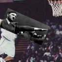
pionteczekessa Napisano 4 Sierpnia 2014 #188594 Napisano 4 Sierpnia 2014 Ostatnio ktoś wspominał, ze każdy banner jest wykonany w innym stylu i nie zgrywają się ze sobą, tak więc zrobiłem coś nowego. Na razie tylko dwie propozycje, bo nie mam pojęcia jak się przyjmą. http://www.iv.pl/images/77387927036614284243.png http://www.iv.pl/images/11632589127418223153.png Jeszcze proponuję zmienić prezentację serwera w prawej części forum na tą ode mnie, wydaje mi się, że jest troszkę lepsza.
EvO Napisano 4 Sierpnia 2014 #188703 Napisano 4 Sierpnia 2014 Prace mi się podobają ale są jasne nawet trochę za bardzo.
Gość Guest Napisano 4 Sierpnia 2014 #188836 Napisano 4 Sierpnia 2014 Są w porządku,ale w ciemniejszej kolorystyce były by jeszcze lepsze.
Cthulhu2 Napisano 4 Sierpnia 2014 #188840 Napisano 4 Sierpnia 2014 Za jasne ;& świecą się jak psu jaja effect glow x666 Zrób coś ciemnego jak moja nyga spark wtedy dam lajka ;p
Gość Guest Napisano 4 Sierpnia 2014 #188845 Napisano 4 Sierpnia 2014 Spróbuj zrobić jakiś baner w stylu dark, będzie o wiele lepiej wyglądał.
pionteczekessa Napisano 5 Sierpnia 2014 Autor #189430 Napisano 5 Sierpnia 2014 Macie w ciemniejszym stylu.
EvO Napisano 5 Sierpnia 2014 #189489 Napisano 5 Sierpnia 2014 Jak dla mnie ten jest dużo lepszy niż tamte, bardziej psuje do forum
Inte Tillgänglig Danke:* Napisano 5 Sierpnia 2014 #189502 Napisano 5 Sierpnia 2014 Moim zdaniem lepszy ten ciemniejszy . Goo Freezu .
Gość Guest Napisano 5 Sierpnia 2014 #189504 Napisano 5 Sierpnia 2014 Ciemniejsza propozycja ładniejsza.
August Napisano 5 Sierpnia 2014 #189522 Napisano 5 Sierpnia 2014 juz lepiej, ale ten motyw jest tak oklepany, ze na co drugim forum o cs'ie go widac..
dupadupadupadupa Napisano 6 Sierpnia 2014 #189687 Napisano 6 Sierpnia 2014 Ta druga propozycja bardzo mi się podoba, jestem na TAK
pionteczekessa Napisano 14 Sierpnia 2014 Autor #193694 Napisano 14 Sierpnia 2014 Coś w ten deseń może? Jeszcze niedokończone, to jest prototyp.
Gość Guest Napisano 14 Sierpnia 2014 #193691 Napisano 14 Sierpnia 2014 Freezu się nie obraź,ale to wygląda jakby w paincie zostało zrobione Ten render nie pasuje i zdeczka ubogo to wygląda. Sam bym lepiej nie zrobił,ale to taka moja opinia.
Atnam Napisano 14 Sierpnia 2014 #193740 Napisano 14 Sierpnia 2014 Ja jestem za pasuje coś nowego dodać
pionteczekessa Napisano 14 Sierpnia 2014 Autor #193954 Napisano 14 Sierpnia 2014 Ale umiecie czytać? 'to jest prototyp', pytam się tylko czy chcielibyście coś w tym stylu, a nie tą pracę, którą pokazałem.
Gość Guest Napisano 14 Sierpnia 2014 #194067 Napisano 14 Sierpnia 2014 Tak Freezu,ale coś co teraz pokazałeś nie będzie pasować(nawet ten prototyp). Pierwsza propozycja była lepsza.
Rekomendowane odpowiedzi
Najaktywniejsi w tym temacie
10
4
3
3
Popularne Dni
4 Sie
9
5 Sie
9
19 Sie
9
28 Sie
8
Najaktywniejsi w tym temacie
pionteczekessa 10 posts
August 4 posts
EvO 3 posts
Zielonaa. 3 posts
Popularne Dni
4 Sie 2014
9 posts
5 Sie 2014
9 posts
19 Sie 2014
9 posts
28 Sie 2014
8 posts